

INF-306 Pre-Exam Practice Tests | (Updated 70 Questions)
Valid INF-306 Exam Q&A PDF - One Year Free Update
NEW QUESTION # 18
The following code adds items to the groceries array from the other arrays. Line numbers are for reference only.
01 < body >
02 < p id= " list " > < /p >
03 < script >
04 var groceries = [];
05 var dairy = [ " Milk " , " Eggs " , " Cheese " , " Ice Cream " ];
06 var beverages = [ " Juice " , " Water " , " Soda " , " Coffee " ];
07 var fruits = [ " Apples " , " Bananas " , " Grapes " , " Oranges " , " Strawberries " ];
08 var vegetables = [ " Broccoli " , " Carrots " , " Lettuce " , " Spinach " , " Tomatoes " ];
09 var meats = [ " Beef " , " Chicken " , " Pork " ];
10
11 function addVegetables() {
12 groceries = groceries.concat(vegetables);
13 }
14
15 function addFruits() {
16 groceries = groceries.concat(fruits);
17 }
18
19 function addOther() {
20 groceries.push(meats[1]);
21 groceries.push(dairy[3]);
22 }
23
24 fruits.shift();
25 addVegetables();
26
27 groceries.shift();
28 addFruits();
29
30 groceries.pop();
31 groceries.shift();
32
33 addOther();
34 document.getElementById( " list " ).innerHTML = groceries;
You need to debug the code on the left to determine how many items are in the groceries array at the specified breakpoints.
Evaluate the code and answer the questions by selecting the correct option from each drop-down list.
Note: You will receive partial credit for each correct answer.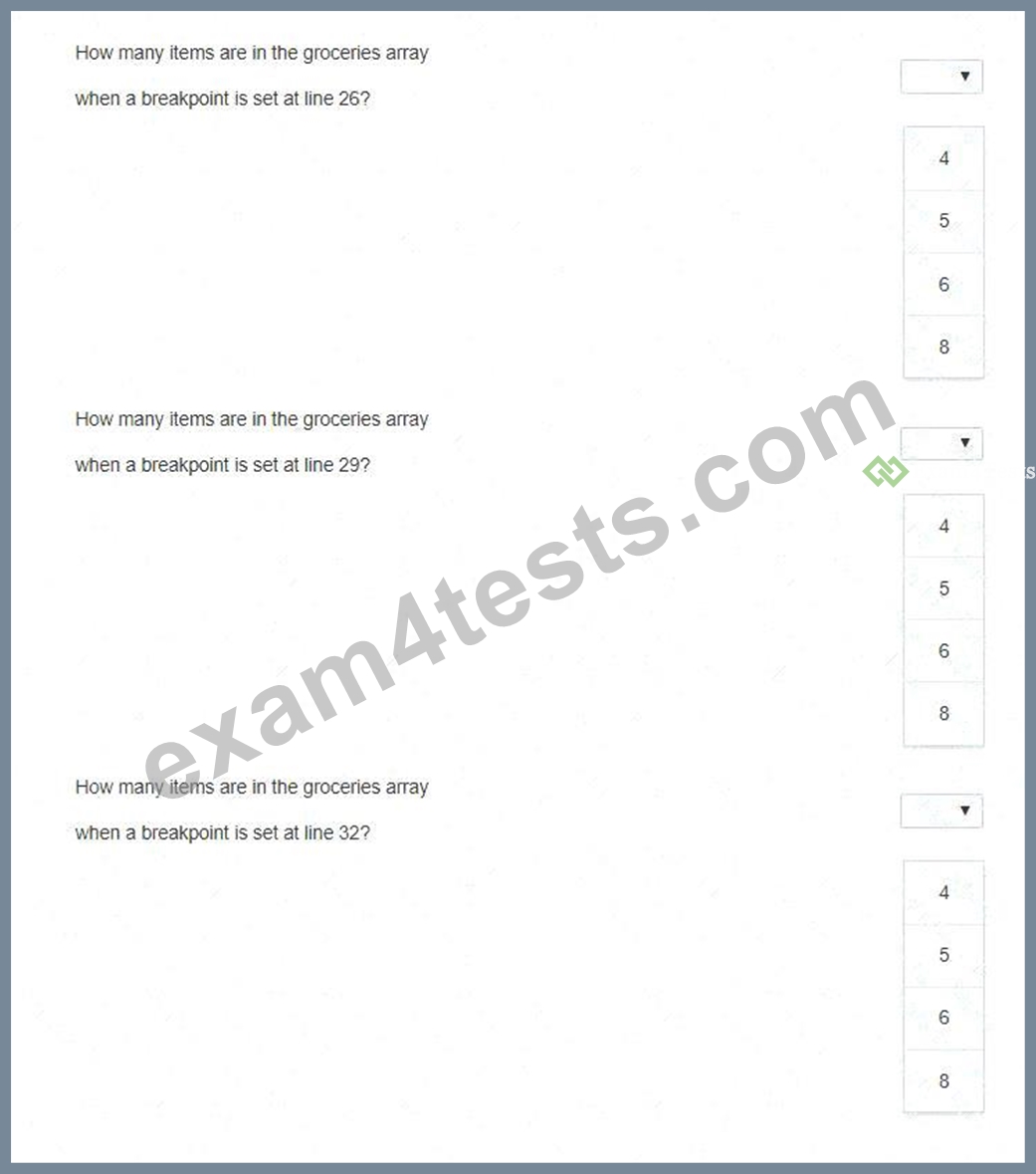
Answer:
Explanation: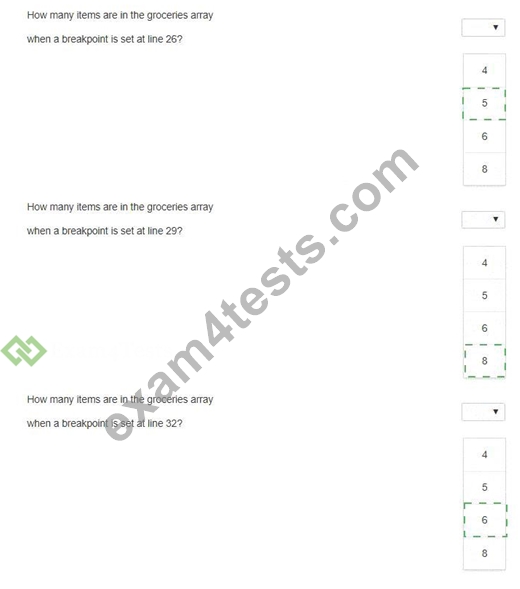
Explanation:
Line 26 drop-down: 5
Line 29 drop-down: 8
Line 32 drop-down: 6
The groceries array starts empty. Line 24 runs fruits.shift(), which removes " Apples " from the fruits array.
This leaves four fruits, but it does not add anything to groceries. Line 25 calls addVegetables(), which executes groceries = groceries.concat(vegetables);. Since vegetables contains five items, groceries contains 5 items at line 26. Line 27 then executes groceries.shift(), removing the first item from groceries and reducing the count to 4. Line 28 calls addFruits(), which appends the four remaining fruits, increasing the array count to 8; therefore, line 29 is 8. Line 30 executes groceries.pop(), removing the last item and reducing the count to
7. Line 31 executes groceries.shift(), removing the first item and reducing the count to 6. Therefore, line 32 is
6. The addOther() function on line 33 has not executed yet at the line 32 breakpoint. References/topics:
JavaScript arrays, debugging breakpoints, concat(), shift(), pop(), push(), array item counting.
NEW QUESTION # 19
You are creating the styling for your webpage. Which two CSS attributes produce a scroll bar if your content overflows its element? Choose 2.
- A. auto
- B. scroll
- C. hidden
- D. visible
Answer: A,B
Explanation:
The correct values are scroll and auto. The CSS overflow property controls what happens when content is too large to fit inside an element's box. MDN describes overflow as setting the desired behavior when content does not fit inside the element's padding box. The value overflow: scroll creates a scroll container and displays scrollbars so overflowing content can be reached, even when the scrollbar may not be strictly needed in some rendering environments. The value overflow: auto also creates scrolling behavior when content overflows, but it is conditional: scrollbars appear only when the content exceeds the available box size. hidden is incorrect because it clips overflowing content and hides the excess rather than exposing it through a scrollbar. visible is also incorrect because it allows overflow to render outside the element box and does not create a scroll container. Therefore, when the question asks which settings produce a scrollbar if content overflows, the precise answers are scroll and auto. References/topics: CSS overflow, scroll containers, overflow clipping, automatic scrollbars, layout flow.
NEW QUESTION # 20
You create an interface for a touch-enabled application. You discover that some of the input buttons do not trigger when you tap them on the screen. You need to identify the cause of the problem. What are two possible causes? Choose 2.
- A. The input areas overlap with other input areas.
- B. The touch screen is not initialized.
- C. The input areas are using event handlers to detect input.
- D. The defined input areas are not large enough.
Answer: A,D
Explanation:
The two likely causes are undersized touch targets and overlapping input regions. Touch input is less spatially precise than mouse input because the contact area of a finger is larger and less exact than a pointer cursor.
Microsoft's touch-target guidance states that interactive UI elements must be large enough for users to access accurately, and recommends a target size around 7.5 mm square, approximately 40 × 40 pixels on a 135 PPI display. Earlier Microsoft touch-design guidance similarly emphasizes that controls must be appropriately sized for touch and identifies approximately 9 mm as a minimum targeting area. Therefore, small input buttons may fail to trigger because the user is not actually hitting the active target area. Overlap is also a valid cause: when two active regions occupy the same physical screen area, hit testing may route the touch to a different element, or the effective target area may be reduced. W3C accessibility guidance explicitly treats overlapping targets as reducing measurable target size unless the overlapping controls perform the same action. Event handlers themselves are not the defect; they are the normal mechanism for processing input.
"Touch screen not initialized" is not a standard HTML5 application cause. References/topics: touch input, event handling, hit testing, target size, overlapping controls.
NEW QUESTION # 21
You write the following markup to create a page. Line numbers are included for reference only.
01 < !DOCTYPE html >
02 < html >
03 < head >
04 < style >
05
10 < /style >
11 < /head >
12 < body >
13 < svg height= " 500 " width= " 500 " >
14 < defs >
15 < filter id= " f2 " x= " 0 " y= " 0 " width= " 200% " height= " 200% " >
16 < feOffset result= " offOut " in= " SourceGraphic " dx= " 20 " dy= " 20 " / >
17 < feGaussianBlur result= " blurOut " in= " offOut " stdDeviation= " 10 " / >
18 < feBlend in= " SourceGraphic " in2= " blurOut " mode= " normal " / >
19 < /filter >
20 < /defs >
21 < text x= " 10 " y= " 100 " style= " fill:red; " > Blur Me! < /text >
22 Sorry, your browser does not support inline SVG.
23 < /svg >
24 < /body >
25 < /html >
An SVG blur filter is defined in the markup on the left. You need to apply the SVG blur filter to the text element on the page.
Which CSS code should you insert at line 05?
- A. text { font: 48px arial bold; filter: #blur;}
- B. text { filter: url( " #f2 " ); font-size: 50pt; color: red;}
- C. text { font: 48px arial bold; fill: blur;}
- D. text { font: 48px arial bold; filter: url(blur);}
Answer: B
Explanation:
The correct CSS is option B because the SVG filter is declared inside < defs > with the identifier id= " f2 " .
To apply an SVG filter from CSS, the filter property must reference that filter by URL syntax using the filter' s ID selector: filter: url( " #f2 " );. The text selector targets the SVG < text > element, so the rule applies the defined filter effect to the visible text content, Blur Me!. The filter itself uses < feOffset > , < feGaussianBlur
> , and < feBlend > to create the blurred visual effect. Option A is incorrect because filter: #blur; is not valid filter-reference syntax and does not match the actual filter ID. Option C is incorrect because fill controls paint color, not filter application, and blur is not a valid fill value. Option D uses url(blur), which does not reference the defined f2 filter and omits the required ID reference. References/topics: SVG filters, < filter > , filter IDs, CSS filter: url(#id), SVG < text > styling.
NEW QUESTION # 22
Review the markup segment. Which entry will validate successfully according to the required pattern?
- A. Kgyn-23-3978-Uhj6
- B. kukX-04-4938-WJDF
- C. AGbe-23h-234-HBG6
- D. y7Ts-A34876-ASFr
Answer: B
Explanation:
The valid entry is A, assuming the OCR-corrupted option represents the intended secret-code format: four letters, a hyphen, two digits, a hyphen, four digits, a hyphen, and four letters. The HTML pattern attribute defines a regular expression that an input value must satisfy during constraint validation. MDN specifies that pattern is used to define a regular expression the input value must match. In the intended pattern, the first group must contain exactly four alphabetic characters, the second group exactly two numeric digits, the third group exactly four numeric digits, and the final group exactly four alphabetic characters. Option A satisfies that structure: kukX is four letters, 04 is two digits, 4938 is four digits, and WJDF is four letters. Option B fails because the final group Uhj6 contains a digit. Option C fails because the first group includes a digit and the digit grouping/hyphen structure is wrong. Option D fails because 23h contains a letter where only digits are allowed. References/topics: HTML5 form validation, pattern attribute, regular-expression validation, text input constraints.
NEW QUESTION # 23
The following form is missing validation attributes:
< form >
< div class= " container " >
< h1 > Register Here < /h1 >
< p > Please fill in the details to create an account with us. < /p >
< hr >
< label for= " ? " > < b > Enter Email < /b > < /label >
< input type= " ? " placeholder= " Enter Email " name= " ? " placeholder= " [email protected] " >
< label for= " ? " > < b > Password < /b > < /label >
< input type= " ? " placeholder= " Enter Password " name= " ? " >
< label for= " ? " > < b > Confirm Password < /b > < /label >
< input type= " ? " placeholder= " Confirm Password " name= " ? " >
< label for= " phone " > < b > Phone < /b > < /label >
< input type= " tel " id= " phone " name= " phone " placeholder= " 123-45-678 " >
< hr >
< p > By creating an account you agree to our < a href= " # " > Terms & Privacy < /a > . < /p >
< button type= " submit " class= " registerbtn " > < strong > Register < /strong > < /button >
< /div >
< /form >
You need to update the form to enforce the following requirements for visitors:
* All fields must be completed with valid information.
* The users should not be allowed to type passwords longer than 8 characters.
* Passwords must use only numbers and letters.
* Phone numbers and email addresses must follow the configuration of the placeholder text.
* The browser must display an error message that makes it clear what type of input change is needed.
Review the markup on the left.
Complete the sentences by selecting the correct option from each drop-down list.
Note: You will receive partial credit for each correct selection.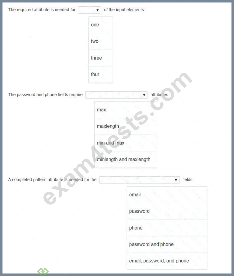
Answer:
Explanation: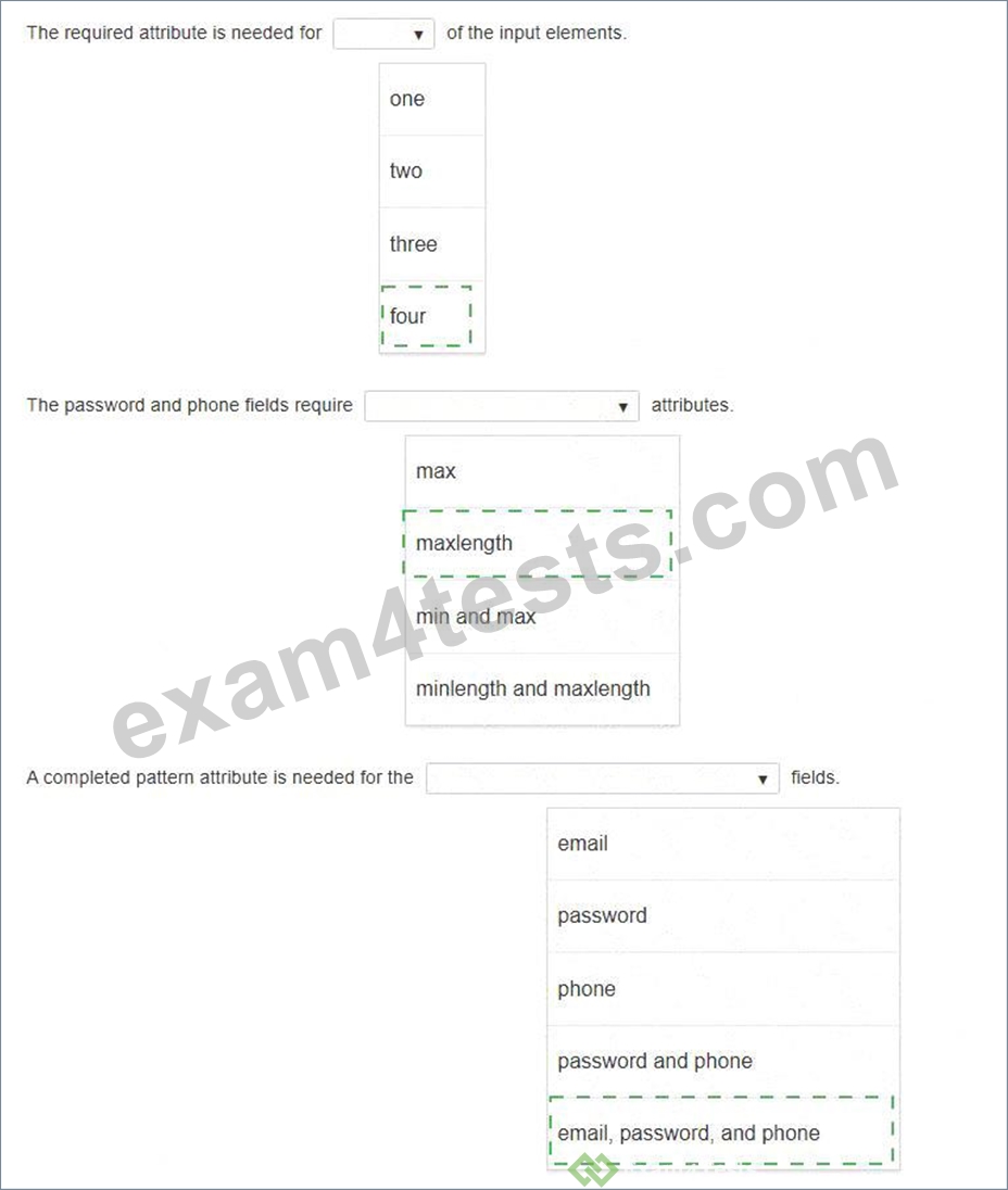
Explanation:
First drop-down: four
Second drop-down: maxlength
Third drop-down: email, password, and phone
The form contains four user-entry input elements: email, password, confirm password, and phone. Since the requirements state that all fields must be completed, the required attribute must be applied to all four inputs.
The password field must prevent entries longer than eight characters, so the correct length-control attribute is maxlength, not max; max applies to numeric/date-style value ranges, while maxlength limits character count in text-style inputs. The phone field also benefits from maxlength because its placeholder format has a fixed visible structure. Finally, completed pattern attributes are needed for email, password, and phone because each has a required format rule: the email must match the placeholder-style address format, the password must use only letters and numbers, and the phone number must follow the placeholder format such as 123-45-
678. The title attribute should accompany these patterns to produce meaningful browser validation messages.
NEW QUESTION # 24
You need to identify the form elements.
Move the appropriate semantic elements from the list on the left to the correct locations on the right.
Note: You will receive partial credit for each correct response.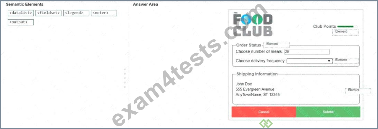
Answer:
Explanation: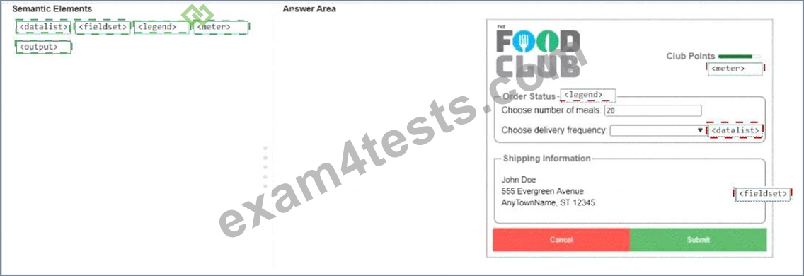
Explanation:
Club Points indicator # < meter >
Order Status group title # < legend >
Choose delivery frequency options # < datalist >
Shipping Information group box # < fieldset >
Displayed shipping information # < output >
The correct semantic elements are selected according to the role each visible form component performs. The Club Points visual indicator represents a scalar measurement within a known range, so it corresponds to < meter > . The bordered Order Status section is a grouped form region, and the caption displayed on the border is a < legend > , which labels a fieldset-style group. The delivery frequency control shows an editable input with selectable predefined values, which is the purpose of < datalist > : it supplies suggested options for an associated input without forcing the user to choose only from the list. The Shipping Information section is visually and semantically a grouped set of related form information, so the surrounding grouping element is < fieldset > . The displayed shipping address is generated or presented as result-style information rather than typed directly in that location, which matches < output > . fieldset groups related controls, legend labels that group, meter displays a bounded measurement, datalist provides input suggestions, and output displays calculated or resulting information.
NEW QUESTION # 25
Which two statements correctly describe media queries? Choose 2.
- A. Media queries allow you to apply different CSS rules on various screens/breakpoints.
- B. Media queries support responsive web design.
- C. Media queries can process JavaScript code dynamically.
- D. Media queries improve the performance of your web page.
Answer: A,B
Explanation:
Media queries support responsive web design and allow different CSS rules to be applied at different screen sizes, device characteristics, or breakpoints. MDN describes media queries as a CSS mechanism for applying styles depending on media type and device or viewport characteristics, including width, height, resolution, and orientation. This is the foundation of responsive design because a page can adapt its layout for phones, tablets, laptops, and desktop displays without changing the HTML document. Breakpoints are the points where the design changes; MDN identifies them as the points where a media query is introduced to improve layout behavior across viewport sizes. Statement A is not generally correct because media queries are primarily a styling and layout mechanism, not a direct performance optimization. They can sometimes help avoid unsuitable layouts, but performance improvement is not their defining purpose. Statement D is incorrect because media queries are CSS rules; they do not execute or dynamically process JavaScript code. References
/topics: responsive design, CSS media queries, viewport width, breakpoints, adaptive layout rules.
NEW QUESTION # 26
Which code segment correctly displays images with 80% transparency and a blue 8px shadow?
- A. filter: opacity(20%) drop-shadow(8px 8px blue);
- B. filter: saturate(20%) box-shadow(8px 8px blue);
- C. filter: saturate(80%) drop-shadow(8px 8px blue);
- D. filter: opacity(80%) box-shadow(8px 8px blue);
Answer: A
Explanation:
The correct segment is D: filter: opacity(20%) drop-shadow(8px 8px blue);. The requirement says the image must have 80% transparency, which means only 20% opacity remains visible. The CSS filter property applies graphical effects to rendered elements, including image effects such as opacity adjustment and drop shadows.
The opacity() filter function is valid inside filter, and values below 100% make the rendered element more transparent. The drop-shadow() function is also a valid CSS filter function and applies a shadow effect to the input image. Option A changes saturation, not transparency. Option B also changes saturation and incorrectly attempts to use box-shadow() as a filter function. Option C uses opacity(80%), which would produce 80% opacity rather than 80% transparency, and it also uses invalid box-shadow() syntax inside filter. References
/topics: CSS filter property, opacity(), drop-shadow(), image effects, transparency.
NEW QUESTION # 27
You need to draw a blue rectangle that meets these conditions:
* It is 200 by 200 pixels.
* It contains a white circle that is centered within the rectangle.
* The circle has a 50-pixel radius.
* The image should appear as follows: a blue square with a centered white circle.
Refer to the image on the left.
You need to ensure that the image scales without distortion when the page is resized. You must not be required to use JavaScript.
Complete the code by selecting the correct option from each drop-down list.
Note: You will receive partial credit for each correct selection.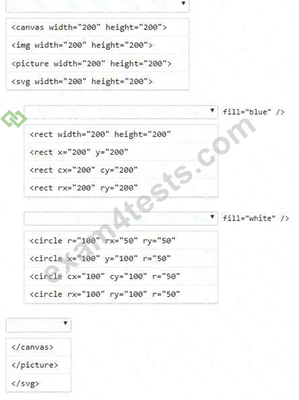
Answer:
Explanation: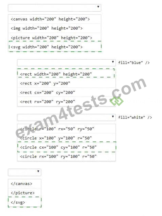
Explanation:
First blank: < svg width= " 200 " height= " 200 " >
Second blank: < rect width= " 200 " height= " 200 "
Third blank: < circle cx= " 100 " cy= " 100 " r= " 50 "
Fourth blank: < /svg >
The correct solution uses SVG because SVG graphics are vector-based and can scale without pixel distortion when the page or viewport changes. A < canvas > element would require script-based drawing logic, which violates the requirement that JavaScript must not be required. An < img > or < picture > element can display an image, but those options do not define the rectangle and circle directly in markup. The outer container must therefore be < svg width= " 200 " height= " 200 " > . The blue square is created with < rect width= " 200 " height= " 200 " fill= " blue " / > , which produces a rectangle matching the required 200-by-200 dimensions.
The centered white circle must use SVG circle geometry: cx= " 100 " and cy= " 100 " place the center at the midpoint of the 200-by-200 square, and r= " 50 " creates the required 50-pixel radius. The final closing tag must be < /svg > .
NEW QUESTION # 28
Which markup segment uses the output element to display the combined value of two input elements in HTML5?
- A. < form > < input type= " number " name= " a " value= " 50 " / > + < input type= " number " name= " b
" value= " 50 " / > = < output name= " c " for= " a b " > < /output > < /form > - B. < form oninput= " a.value+b.value " > < input type= " number " name= " a " value= " 50 " / > + < input type= " number " name= " b " value= " 50 " / > < /form >
- C. < form oninput= " c.value=a.value+b.value " > < input type= " number " name= " a " value= " 50 " / >
+ < input type= " number " name= " b " value= " 50 " / > = < output name= " c " for= " a b " > < /output
> < /form > - D. < form > < input type= " number " name= " a " value= " 50 " / > + < input type= " number " name= " b
" value= " 50 " / > = < output name= " c " for= " a b " > a+b < /output > < /form >
Answer: C
Explanation:
Option C is the only segment that correctly combines three required pieces: two contributing < input > controls, a named < output > control, and executable form-level logic that assigns a calculated value into that output. The HTML < output > element is specifically designed as a container for the result of a calculation or user action, and its for attribute identifies the controls that contributed to the calculation by using a space- separated list of element identifiers or associated names in the form workflow. MDN's reference demonstrates this exact pattern: two input values are added, and the result is assigned to an < output > element whenever input changes. Option A renders literal text inside < output > but does not update it. Option B has no < output
> element at all, so it cannot satisfy the requirement. Option D declares an output but lacks an oninput handler or script assignment, so the displayed value never changes. References/topics: HTML5 forms, < output > element, for attribute, form input events, calculated form results.
NEW QUESTION # 29
You define the Pet class as follows:
class Pet {
constructor(name, breed) {
this.name = name;
this.breed = breed;
this.show = function() {
var text = " < p > Your pet ' s name is " + name + " . The pet ' s breed is " + breed + " . < /p > " ; return text;
};
}
}
You need to derive a Dog class from the Pet class.
Complete the code by selecting the correct option from each drop-down list.
Note: You will receive partial credit for each correct selection.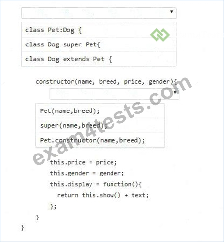
Answer:
Explanation: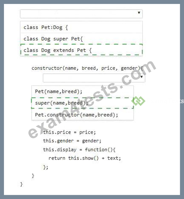
Explanation:
First blank: class Dog extends Pet {
Second blank: super(name, breed);
The correct syntax for deriving one JavaScript class from another is extends, so the derived class declaration must be class Dog extends Pet {. This creates Dog as a subclass of Pet, allowing Dog instances to inherit members defined by the Pet constructor, including name, breed, and the show() function assigned inside the parent constructor. Inside a derived class constructor, super() must be called before using this. The call super (name, breed); invokes the parent Pet constructor and passes the values required to initialize the inherited name and breed properties. Pet(name, breed); is incorrect because a class constructor cannot be invoked like a normal function. Pet.constructor(name, breed); is also incorrect because it does not call the parent constructor for the current instance. After super() runs, the Dog constructor can safely assign subclass-specific properties such as price and gender. References/topics: JavaScript classes, inheritance, extends, derived constructors, super(), custom class creation.
NEW QUESTION # 30
You want to display a message box showing the user ' s current latitude and longitude as identified by the user' s browser.
Complete the code by selecting the correct option from each drop-down list.
Note: You will receive partial credit for each correct selection.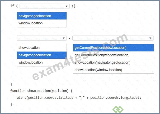
Answer:
Explanation: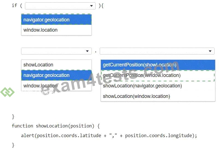
Explanation:
First drop-down: navigator.geolocation
Second drop-down: navigator.geolocation
Third drop-down: getCurrentPosition(showLocation)
The correct API object is navigator.geolocation because browser-based geographic location is exposed through the Geolocation API, not through window.location. window.location represents the current page URL and navigation state; it does not provide latitude or longitude. The first selection checks whether the browser supports geolocation by evaluating navigator.geolocation. Inside the block, the same object must be used to request the user's current position. The correct method is getCurrentPosition(showLocation), which requests the device's current location and passes a position object to the callback function when the location is available. The callback then reads position.coords.latitude and position.coords.longitude and displays those values with alert(). The alternatives that pass window.location are incorrect because they provide page- location information rather than geographic coordinates. The alternatives that call showLocation(...) directly are also incorrect because the browser must first retrieve the actual position object. References/topics:
Geolocation API, navigator.geolocation, getCurrentPosition(), callback functions, latitude and longitude.
NEW QUESTION # 31
Which two background graphics will automatically adjust to different screen sizes? Choose 2.
Note: You will receive partial credit for each correct selection.
- A. < body style= " background:url(media/background.jpg); background-size:contain; background-repeat:
no-repeat; " > - B. < body style= " background:url(media/background.jpg); background-size:initial; background-repeat:no- repeat; " >
- C. < body style= " background:url(media/background.jpg); background-size:cover; background-repeat:no- repeat; " >
- D. < body style= " background:url(media/background.jpg); background-size:auto; background-repeat:no- repeat; " >
Answer: A,C
Explanation:
The correct answers are A and C because background-size: contain and background-size: cover are the CSS values that scale a background image in response to the size of the element or viewport. contain scales the background image as large as possible while preserving the entire image inside the background area. This prevents cropping and maintains the image's aspect ratio, although empty space may appear if the container and image proportions differ. cover also preserves the aspect ratio, but scales the image until the entire background area is filled; this may crop part of the image, but it prevents empty space. Both values are commonly used in responsive design because the image automatically recalculates its rendered size as the page or element changes dimensions. initial resets the property to its default behavior and does not intentionally create responsive scaling. auto uses the image's intrinsic dimensions or proportional automatic sizing, so it does not reliably adjust the graphic to different screen sizes in the way required. References
/topics: responsive design, CSS background images, background-size, contain, cover, viewport-based scaling.
NEW QUESTION # 32
You need to correctly apply a style rule for screen devices with a width of 480 pixels or less.
Complete the code by selecting the correct option from the drop-down list.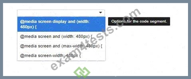
Answer:
Explanation: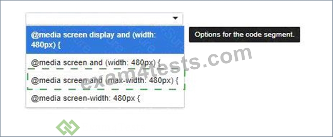
Explanation:
@media screen and (max-width: 480px) {
/* style rules go here */
}
The correct media query is @media screen and (max-width: 480px) {. The requirement says the style rule must apply to screen devices with a width of 480 pixels or less. In CSS media queries, screen identifies the media type, and (max-width: 480px) defines the upper viewport-width limit. This means the enclosed CSS rules apply when the viewport is 480 pixels wide or any smaller value, which is the standard mobile breakpoint behavior. @media screen and (width: 480px) is incorrect because it applies only when the viewport is exactly 480 pixels wide, not below it. @media screen display and (width: 480px) is invalid syntax because display is not used that way in a media query. @media screen-width: 480px is also invalid because it does not follow the required @media media-type and (feature: value) pattern. References/topics: responsive design, CSS media queries, @media, screen media type, max-width, mobile breakpoint styling.
NEW QUESTION # 33
You need to define a grid that meets the following requirements:
* Explicitly sets the width of 6 equal columns of 1 fraction
* Explicitly sets 5 varied sized rows
* Defines 15px of space between each grid column
* Defines 10px between each grid row
Complete the code by selecting the correct option from each drop-down list.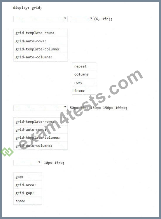
Answer:
Explanation: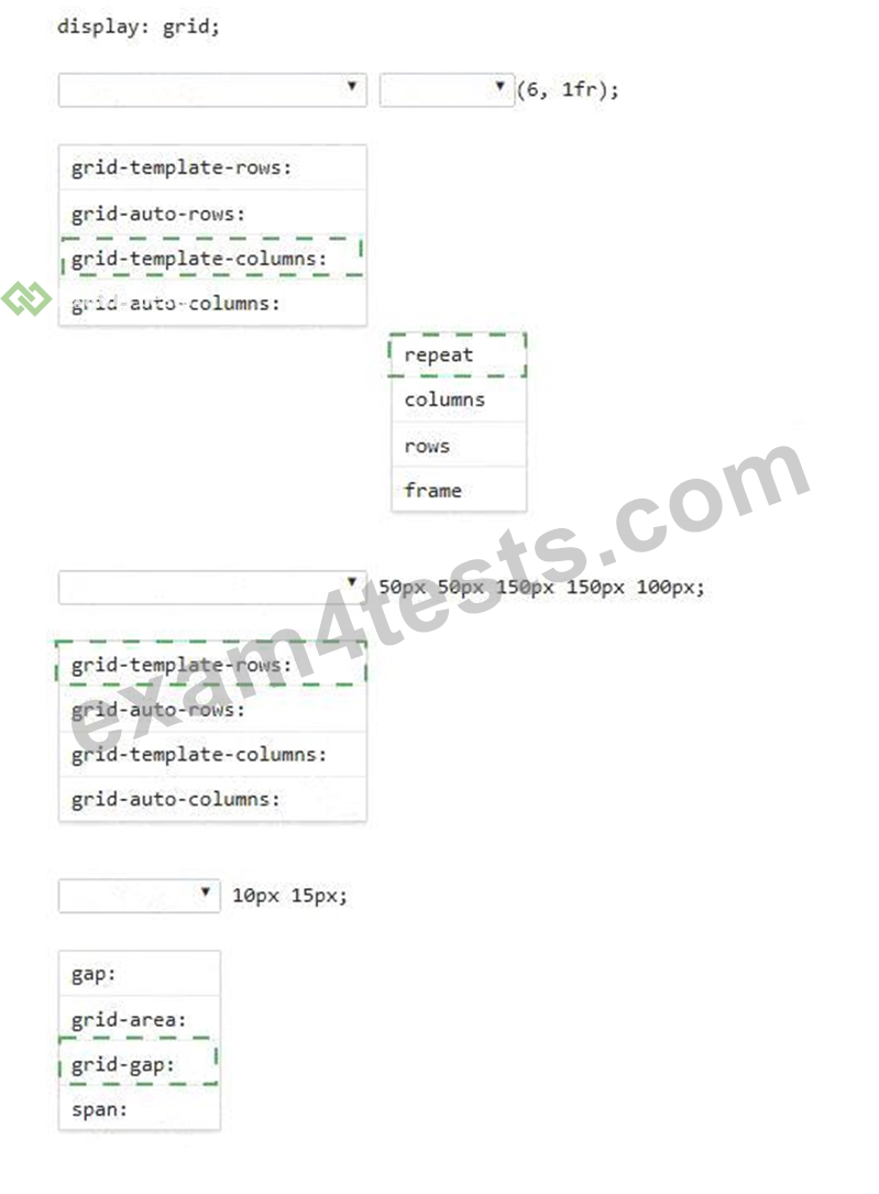
Explanation:
display: grid;
grid-template-columns: repeat(6, 1fr);
grid-template-rows: 50px 50px 150px 150px 100px;
grid-gap: 10px 15px;
The correct grid definition starts with display: grid;, which turns the element into a CSS Grid container. To explicitly create six equal-width columns, the correct property is grid-template-columns, and the most efficient value is repeat(6, 1fr). The repeat() function avoids writing 1fr six separate times, while 1fr assigns each column one equal fraction of the available grid width. The five row sizes must be explicitly declared with grid-template-rows, using the exact varied values shown: 50px 50px 150px 150px 100px. This creates five rows with fixed pixel heights. For the spacing requirement, grid-gap: 10px 15px; is the correct shorthand.
The first value controls the row gap, so rows are separated by 10px; the second value controls the column gap, so columns are separated by 15px. References/topics: CSS Grid containers, explicit grid tracks, grid-template- columns, grid-template-rows, repeat(), fractional units, grid gaps.
NEW QUESTION # 34
A form has four buttons with a class of item. You need to apply an event listener to all buttons to invoke the moveElement function when a button is pressed. Your code must ensure bubble capture.
Complete the markup by selecting the correct option from each drop-down list.
Note: You will receive partial credit for each correct selection.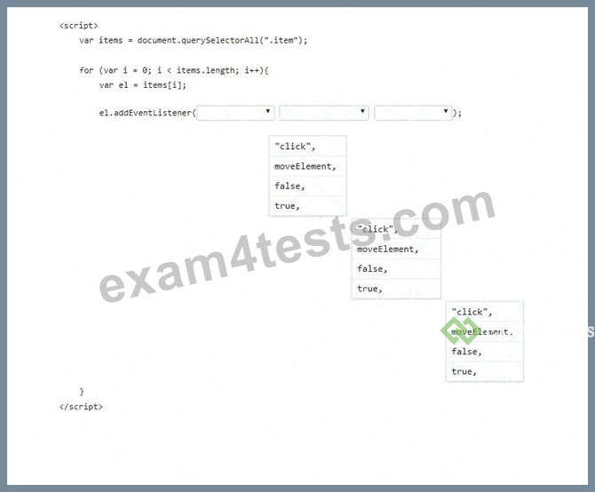
Answer:
Explanation: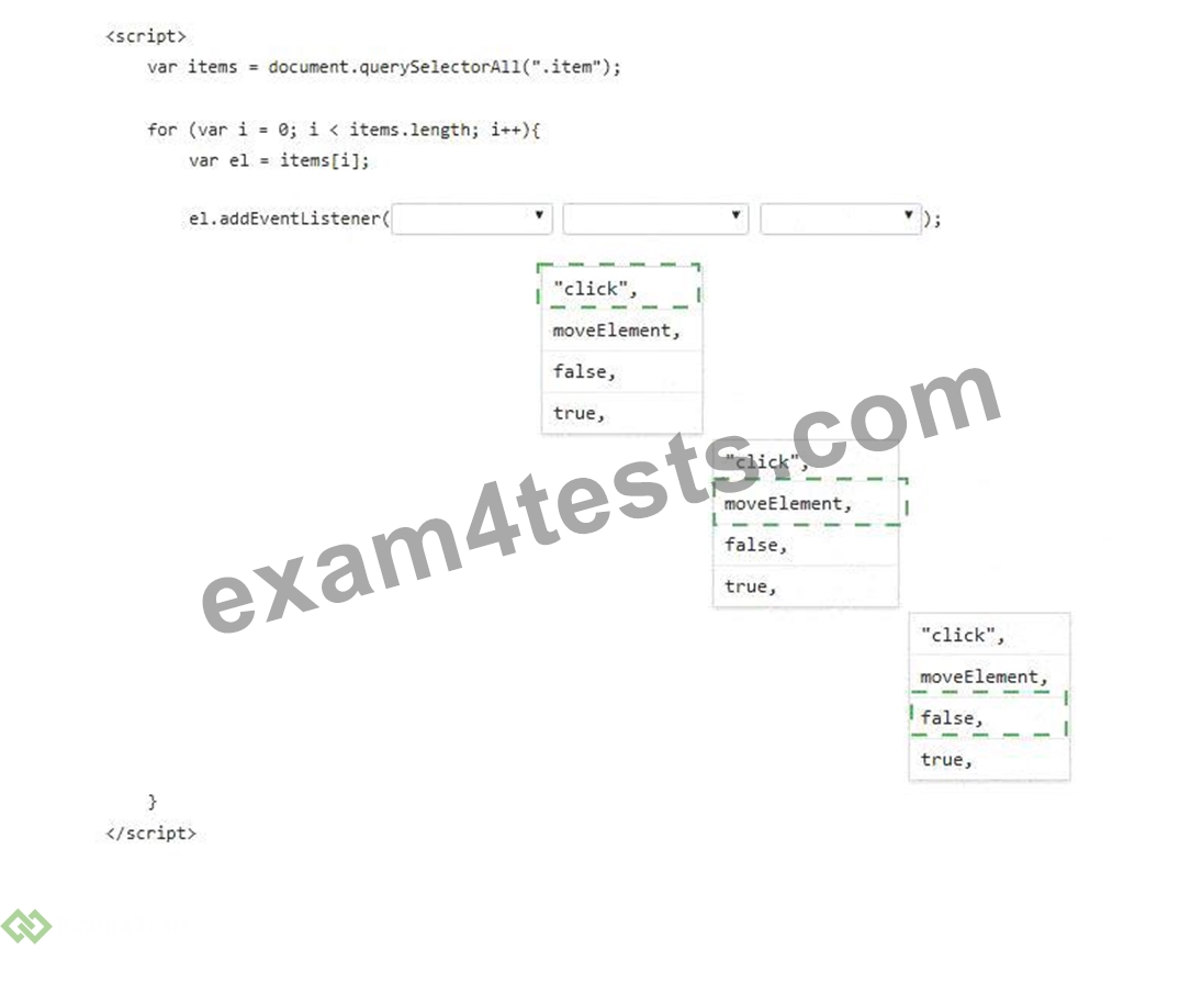
Explanation:
First drop-down: " click " ,
Second drop-down: moveElement,
Third drop-down: false,
The correct event listener syntax is addEventListener(type, listener, useCapture). The first argument must be " click " because the function must run when a button is pressed. The second argument must be moveElement, not moveElement(), because the event listener expects a function reference. Using parentheses would call the function immediately while the page is loading instead of waiting for the user to press a button. The third argument controls the event phase. false means the listener runs during the bubbling phase, which is the normal behavior for button click handling. true would register the listener for the capturing phase instead.
Since the code uses document.querySelectorAll( " .item " ), it selects all elements with the class item. The for loop then attaches the same click listener to each selected button individually. This ensures that all four buttons invoke moveElement when clicked.
NEW QUESTION # 35
Review the grid container requirements and mockup on the left. Which markup should you use to define the grid container?
- A. Uses grid-template-columns and grid-template-rows with percentage and pixel sizing.
- B. Incorrectly places named area strings under grid-template-rows.
- C. Incorrectly places named area strings under grid-template-columns.
- D. .grid-container { display: grid; grid-template-areas: " heading heading heading heading heading heading
" " menu content content content right right " " menu contact contact contact contact contact " ; grid- gap: 10px; background-color: orange; padding: 10px;}
Answer: D
NEW QUESTION # 36
Match each stage of Application Lifecycle Management to the task that occurs during that stage.
Move each stage from the list on the left to the correct task on the right.
Note: You will receive partial credit for each correct match.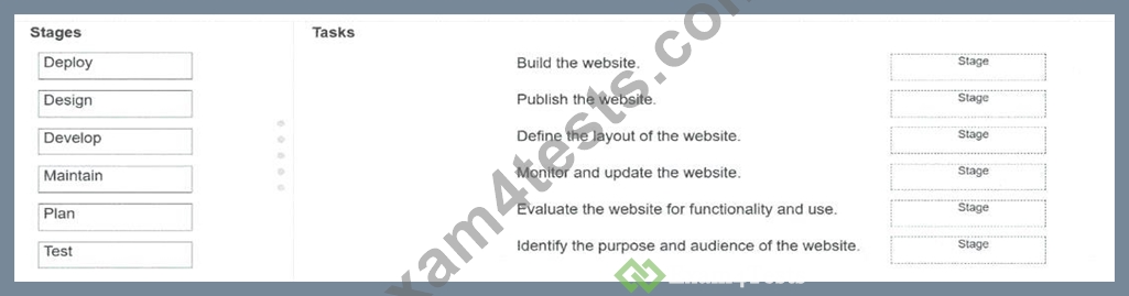
Answer:
Explanation: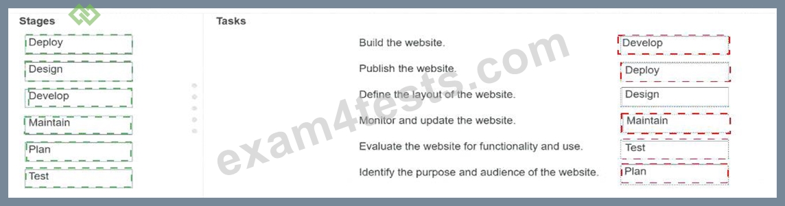
Explanation: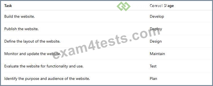
Application Lifecycle Management organizes website creation into ordered stages that move from intent to implementation and long-term support. The Plan stage comes first because it establishes why the website exists, who the audience is, and what goals the application must satisfy. The Design stage converts those requirements into structure, including page layout, navigation, interface organization, and visual arrangement.
The Develop stage is where the website is built by writing HTML markup, CSS styling, JavaScript behavior, and integrating required assets or APIs. The Test stage evaluates whether the completed website functions correctly and is usable according to requirements; this includes checking features, layout behavior, validation, and user workflows. The Deploy stage publishes the finished website to the target hosting or production environment so users can access it. Finally, the Maintain stage occurs after release and includes monitoring, updating, fixing defects, improving compatibility, and keeping content or functionality current. References
/topics: application lifecycle management, planning, design, development, testing, deployment, maintenance.
NEW QUESTION # 37
You need to complete the code for a registration form that must meet the following criteria:
* The Password must be 6-8 characters long and use only letters and numbers.
* The Member ID must follow the pattern ###-##-###.
Complete the markup by selecting the correct option from each drop-down list.
Note: You will receive partial credit for each correct selection.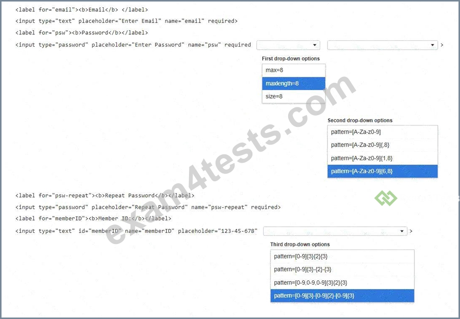
Answer:
Explanation: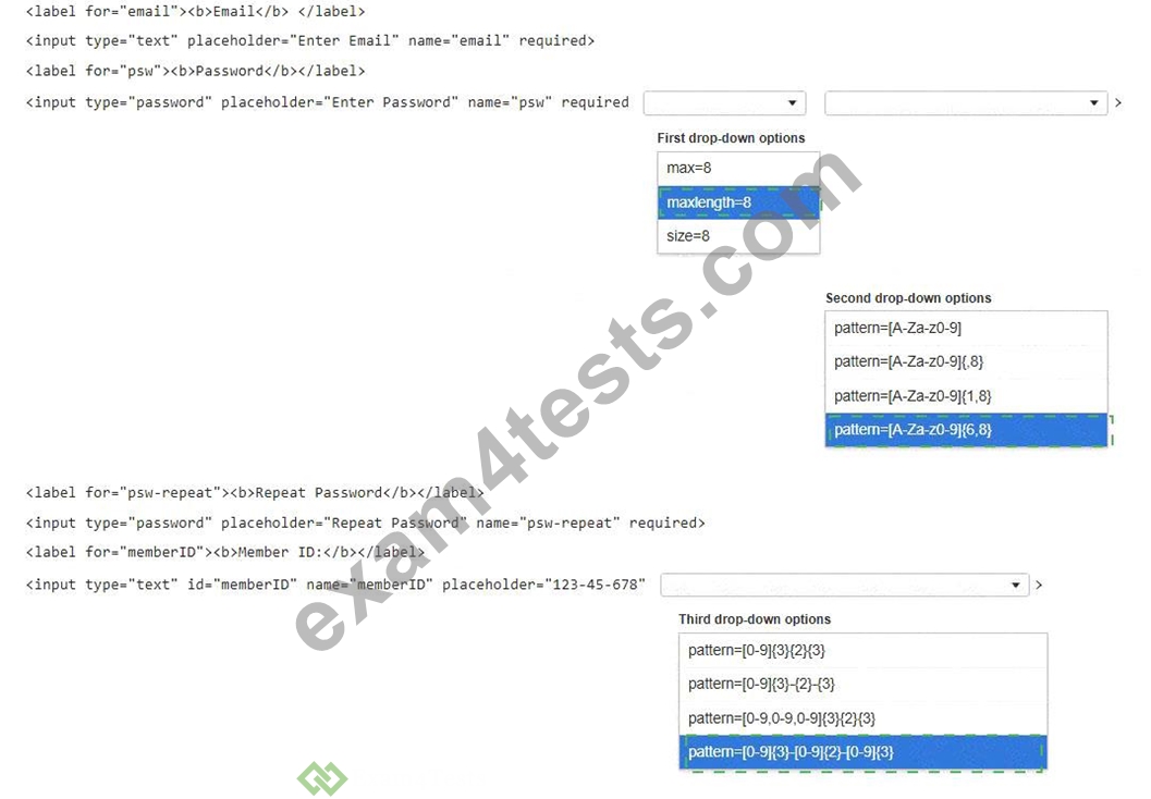
Explanation:
First drop-down: maxlength=8
Second drop-down: pattern=[A-Za-z0-9]{6,8}
Third drop-down: pattern=[0-9]{3}-[0-9] {2}-[0-9]{3}
The password field needs two constraints. maxlength=8 limits the user to a maximum of eight characters, satisfying the upper length requirement. The pattern=[A-Za-z0-9]{6,8} attribute enforces the complete password rule: only uppercase letters, lowercase letters, and digits are allowed, and the total length must be between six and eight characters. A pattern without {6,8} would not enforce the minimum length, and {1,8} would incorrectly allow passwords shorter than six characters. The Member ID field must follow the visible placeholder format 123-45-678, which is three digits, a hyphen, two digits, another hyphen, and three digits.
Therefore, the correct member ID pattern is pattern=[0-9] {3}-[0-9]{2}-[0-9] {3}. The hyphens must be included literally in the pattern because the required format contains them. max=8 is not appropriate for password text length, and size=8 only controls display width, not validation.
NEW QUESTION # 38
The ctx variable is the context of an HTML5 canvas object. What does the following HTML markup draw?
ctx.arc(x, y, r, 0, Math.PI, true);
- A. A circle at the given point
- B. A line from one point to another
- C. A square at the given point
- D. A semicircle at the given point
Answer: D
Explanation:
The statement draws a semicircle at the specified point. The arc() method of the Canvas 2D API adds a circular arc to the current path. Its core parameters are the center point x, y, the radius, the starting angle, the ending angle, and an optional direction flag. In this expression, x and y define the center of the arc, and r defines its radius. The start angle is 0 radians, and the end angle is Math.PI radians. Since Math.PI represents
180 degrees, the path covers exactly half of a full circle. The final argument, true, tells the canvas context to draw the arc counterclockwise rather than using the default clockwise direction; however, the angular span remains half of the circumference. The call does not draw a complete visible shape unless the path is later stroked or filled, but the geometric path being created is a semicircular arc. It is not a straight line, square, or full circle. References/topics: Canvas 2D context, arc() method, radians, path construction, drawing arcs and circles.
NEW QUESTION # 39
Move the appropriate attributes from the list on the left to the correct descriptions on the right. You may use each attribute once, more than once, or not at all.
Note: You will receive partial credit for each correct match.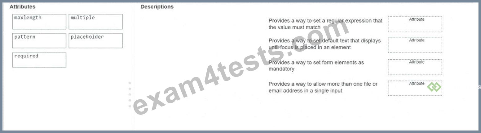
Answer:
Explanation: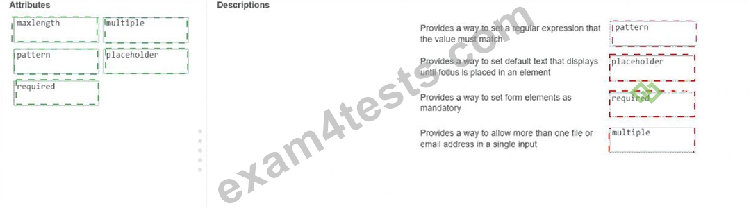
Explanation:
pattern # Provides a way to set a regular expression that the value must match placeholder # Provides a way to set default text that displays until focus is placed in an element required # Provides a way to set form elements as mandatory multiple # Provides a way to allow more than one file or email address in a single input The correct matches are based on standard HTML5 form validation and input-attribute behavior. The pattern attribute defines a regular expression that the input value must satisfy before the form can be submitted successfully. It is commonly used for structured values such as phone numbers, codes, postal formats, or custom identifiers. The placeholder attribute supplies short hint text inside an input field, helping the user understand the expected value before entering data. The required attribute makes a form control mandatory; if the field is empty, constraint validation prevents successful submission. The multiple attribute allows a single input to accept more than one value, specifically for controls such as input type= " file " and input type= " email " , where users may upload multiple files or enter multiple email addresses. The maxlength attribute is not used in these matches because it limits the maximum number of characters that can be entered, but none of the listed descriptions asks for character-length restriction. References/topics: HTML5 form attributes, constraint validation, pattern, placeholder, required, multiple, input validation.
NEW QUESTION # 40
......
HTML5 Application Development Free Update Certification Sample Questions: https://exam-labs.exam4tests.com/INF-306-pdf-braindumps.html